Inventory KPIs Every Business Should Track (and How to Read Them)

Most businesses either track too few inventory metrics to catch real problems, or track so many dashboards that nobody actually looks at them. Often this is a symptom of running everything through spreadsheets instead of a system that surfaces these numbers automatically. A short list of KPIs that connect to each other beats a long list that doesn't.
A handful of connected KPIs, reviewed weekly, generally drives more action than 20+ metrics reviewed once a quarter.
Origins: from Just-In-Time to the balanced scorecard
Modern inventory KPIs owe a lot to two separate management movements. Toyota's Just-In-Time production system, developed from the 1950s onward, pushed manufacturers to obsess over inventory efficiency rather than treating stock as a comfortable buffer. Decades later, Robert Kaplan and David Norton's Balanced Scorecard (1992) pushed businesses generally toward tracking a small, connected set of metrics instead of financial numbers alone. The five-KPI approach below is really that same idea, scoped down to inventory specifically.
The five that matter most
Inventory turnover (how fast stock moves), stock coverage (days of inventory left), GMROI (return per dollar invested), stockout rate (how often you run out), and dead stock percentage (inventory that isn't moving). Each answers a different question, and together they cover almost every real inventory problem.
What Metrics Track Inventory Turnover Ratio?
Turnover ratio is rarely read alone — a small cluster of related inventory turnover metrics fills in what the raw ratio leaves out:
- Inventory turnover — COGS ÷ average inventory value; the base speed metric
- Days Inventory Outstanding (DIO) — 365 ÷ turnover; the same number expressed as days of stock on hand, often more intuitive to discuss
- Sell-through rate — units sold ÷ units received, usually tracked over a shorter window than turnover, useful for spotting a specific slow-moving batch
- GMROI — turnover weighted by margin, since a fast-turning product isn't automatically a profitable one
- Stockout rate — read alongside turnover to check whether a high number reflects real demand or just chronic understocking
Reading turnover next to these — rather than as a single isolated ratio — is what separates "the number went up" from actually knowing why.
The formulas at a glance
Turnover = COGS ÷ Average inventory value
Coverage (days) = Inventory on hand ÷ Average daily sales
GMROI = Gross margin ÷ Average inventory cost
Stockout rate = Stockout occurrences ÷ Total demand instances
Dead stock % = Dead stock value ÷ Total inventory value

Building an Inventory KPI Dashboard
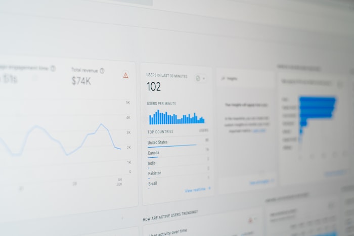
A dashboard is only as useful as its restraint. The five KPIs above are enough to cover speed, profitability, availability, and dead capital in a single view — resist the urge to add more just because a number is easy to pull. A workable layout groups them into three panels:
- Speed panel — turnover and coverage, side by side, by category
- Profitability panel — GMROI by category, flagged when below 1
- Risk panel — stockout rate and dead stock %, both trended over the last 90 days
Refreshed weekly and broken down by category (not just company-wide), this three-panel structure catches most problems before they compound — without turning into the 20-metric dashboard nobody opens.
Why these five, and not more
Turnover and coverage both describe speed, but from different angles. GMROI adds the financial lens turnover alone misses. Stockout rate catches what GMROI and turnover can look fine while still hiding — lost sales. Dead stock percentage catches the opposite failure mode: capital that isn't moving at all. Together, they cover both "too fast" and "too slow" failure modes.
A worked snapshot
| KPI | This quarter | Reading |
|---|---|---|
| Turnover | 6.2x / year | Healthy for the category |
| Coverage | 58 days | Comfortable buffer |
| GMROI | 1.4 | Above break-even |
| Stockout rate | 4.5% | Worth investigating which SKUs |
| Dead stock % | 9% | Within normal range, monitor |
Signs your KPI setup isn't working
- You have a dashboard with 20+ numbers and can't say which 3 actually drive decisions
- Metrics are reviewed monthly or quarterly, by which point the window to act has passed
- No one can explain how any two of your KPIs relate to each other
- KPIs are tracked company-wide only, never broken down by category or SKU
A KPI you don't act on isn't a KPI — it's decoration on a dashboard.
How they work together
A product with high turnover but a high stockout rate isn't actually performing well — it's selling out because it's underordered, not because demand is perfectly served. Better demand forecasting is usually the actual fix, not simply raising safety stock blindly. A product with low GMROI but low dead stock isn't dead weight — it's just not returning much per dollar, which is a pricing or sourcing conversation, not a clearance one. Reading KPIs in isolation is where most misdiagnoses come from.
How to put this into practice
More metrics don't mean more insight if nobody reviews them regularly.
Frequency matters more than depth — small course corrections beat big quarterly fixes.
Turnover, GMROI, and stockout rate tell a fuller story combined than any one of them alone.
Limitations to keep in mind
- Benchmarks are industry-specific — a "good" turnover number in grocery is a terrible one in furniture, and vice versa
- Lagging, not leading — most of these describe what already happened; they flag problems, they don't predict them on their own
- KPIs can be gamed — a stockout rate can look great simply by overstocking everything, which then shows up as a worse GMROI and coverage number instead
Key takeaways
Turnover, coverage, GMROI, stockout rate, and dead stock percentage cover almost every real inventory problem — read together, weekly, not as 20 isolated numbers reviewed once a quarter.
See also
- Just-In-Time (JIT) inventory management
- Balanced Scorecard
- GMROI
- Dead stock
- Demand forecasting
Want to see this with your own company's data?
Upload your spreadsheet and get the analysis in seconds, for free.